Final Product: The Cost of Sick Oysters
Reply

The Cost of Sick Oysters
ASCS Infographic First Draft
Lauren Huey
Rough draft of layout:
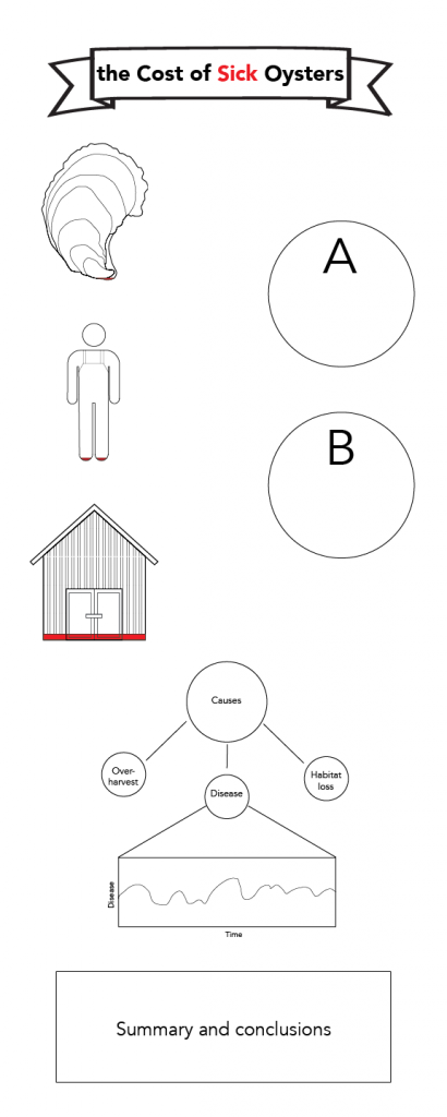
The images that I made of the oyster, the oysterman, and the shucking house represent the change from historical statuses. The full oyster image represents how many bushels of oysters there were in the Chesapeake Bay before their decline with the red portion representing the oysters present in the Bay today, which is about 1% of historical populations (Newell 1988). The oysterman represents the 50,000 oystermen working in the Bay at the peak of harvest in the 1880’s, with the 1000 people with oyster harvest licenses today represented by the red portion (Chesapeake Bay Program 2010). Lastly, the building represents the 136 shucking houses that were in operation in 1974 with the red portion signifying the 6 that were still operating as of 2010 (Chesapeake Bay Program 2010). There will be text to accompany the images but I haven’t written it yet. It will likely be a more concise version of the explanation of the images above. The size of the red portions was calculated based on the percent of the historical status of each factor today, with this percentage applied to the height of the figure and the resulting height being colored red. Through these images, I want to show the effect that the collapse of the oyster fishery had on the local economy and jobs.
A and B are small info bubbles. A will be about the debate on whether or not to introduce a non-native oyster to the Chesapeake Bay that occurred for over a decade. B will state that an estimated $4 billion was lost to Virginia and Maryland’s economy due to the oyster decline (Chesapeake Bay Program 2010).
The bottom portion of the infographic will discuss the causes of decline and bring oyster disease to the forefront. I will include a graph of Perkinsus marinus prevalence over time to show that it is still present at high levels in the Chesapeake Bay. I will end with the light at the end of the tunnel: oysters are recovering, with scientists trying to understand this recovery (which is what I’m doing) so that we can harness the natural resilience of oysters to improve fishery management and restoration efforts.
References:
Chesapeake Bay Program. 2010. On the Brink: Chesapeake’s Native Oysters. Annapolis. https://www.chesapeakebay.net/
Newell, R.I.E. 1988. Ecological changes in Chesapeake Bay: Are they the result of
overharvesting the eastern oyster (Crassostrea virginica). In M.P. Lynch and E.C.
Krome, editors. Understanding the Estuary: Advances in Chesapeake Bay Research.
Solomons, Maryland: Chesapeake Research Consortium Publication 129. CBP/TRS
24/88. pp 536-546.
Updated Layout:

Oysters are the darlings of the Chesapeake. 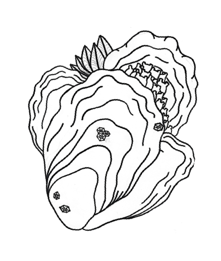
People here have a profound sense of pride in the little reef-forming bivalves, and with good reason. Oysters provide numerous ecosystem services such as filtering our water, dampening erosive wave energy with their reefs, and providing habitat for a plethora of other species. They also support a fishery that has been crucial to human settlements for hundreds of years. Because of this, the public is well aware of the oyster narrative and concerned by the oyster’s struggle with disease since the 1960’s. I plan to use this innate interest to disseminate my research on oyster adaptation to disease.
My outreach product will be a shareable social media graphic created in Adobe Illustrator and InDesign depicting the socio-economic impact of oyster disease in the Chesapeake Bay. Data used will include oyster landings from the Virginia Marine Resources Commission, disease severity and prevalence from scientific literature, and economic data from Maryland and Virginia. It will be heavy on appealing visuals with as little text as possible. I want the message to come across quickly and easily through a carefully arranged series of graphs and images. I will likely make my own illustrations for this project in addition to using symbols from the Integration & Application Network. I plan to distribute the finished product through Twitter and Facebook. I am choosing to focus on this topic over the other two infographics (disease ecology and evolution of marine diseases) that I plan to make before graduation because the fishery just opened for the season and I believe there will be interest in the topic of the oyster industry and economics.
The infographic will start with some background on oysters and their value to the Chesapeake Bay. The introduction will lead into a graph of oyster landings over time. There is a precipitous drop in the oyster seed industry and wild harvest in the late 1950’s and 1980’s, respectively. This coincides with two major disease outbreaks. From there, I can explain the economic impact on Maryland and Virginia in terms of loss of money to the industry and also the social costs, such as the loss of jobs. I also hope to present a light at the end of the tunnel by summarizing some current oyster disease research, which indicates that the situation is improving.
My intended audience is coastal landowners and the Chesapeake community, but the distribution of the product will not be controlled, as it will be shareable on social media. Therefore, I hope to make it interesting to the general public because I am not sure who will come across it. Despite this, I still want to tailor the product to coastal landowners of the Chesapeake. My goal is to educate them about what is occurring in their backyards. I want to raise awareness about oyster disease as a way to get people interested in the disease and adaptation research that I am doing. I am hoping that this graphic will supply the “why we should care” portion of communicating my research because it will illustrate how disease has impacted the areas that the target audience inhabits.